
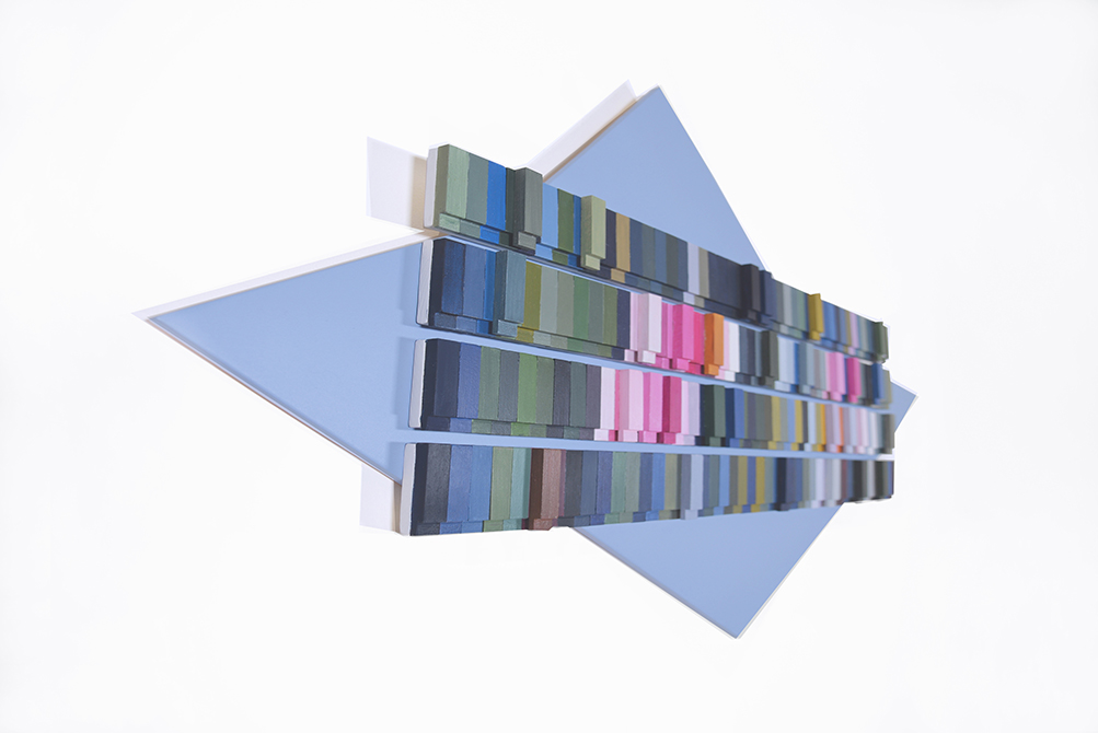
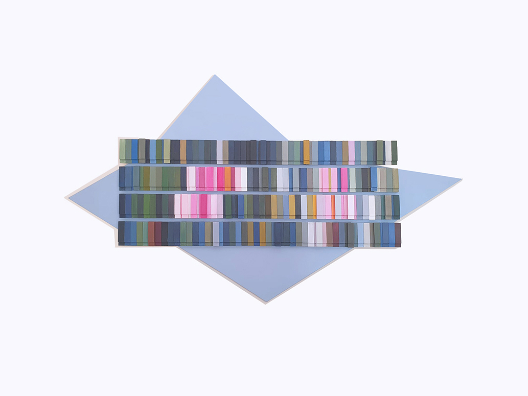
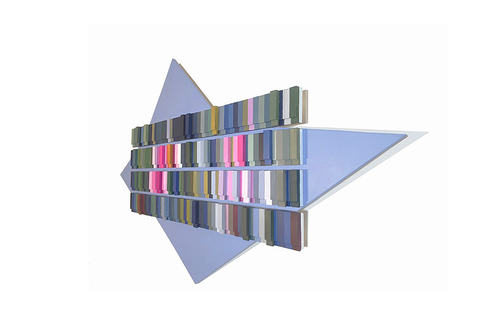
Essences chromatiques #2 Nénuphar Laydekery Rosea, 2022
wood, acrylic paints, softy touch varnish finish
cm 134 x 78 x 4
Studies of the water lily Laydekery rosea on two consecutive days but with completely different light and weather conditions. Unifications of the two views in one work.
Taken from the diary written by the artist
Le Temple Sur Lot, 8 September 2019
1st day: sky opaque azure-white; 2nd day: sky of great brightness, azure-dark grey, progressive presence of grey-white clouds.
In the same position and at the same time on two consecutive days I took two snaps with the same shot of Nymphaea Laydekeri Rosea. The petals, in conditions of opacity of the sky, almost the colour of the female complexion, have become bright pink almost shocking pink, as the clouds increased and shielded the sun. The centre of the water lily, a yellow midway between cadmium and Naples yellow, has turned into an oran- gey yellow from the vibrant contrasts with the almost fluo pink flower. The mixture of white-ochre and crimson of the petals has given way to a mix of magenta, white and blue. The greens of the leaves, pale azure-grey-yellowish, is desaturated; at the change of light they have become brighter, more intense, an emerald with cobalt touches, with the addition on the edges and the broader surface of maroon, almost chocolate brown.
Finally the water. The dark and cold tones of the blue-black-maroon of the greyish-az- ure water, almost uniform on the liquid surface, are cooled to a dark, deep, mysterious blue on which rest the white-grey-azure reflections of the clouds.
In both views, the nature exhibited analogous colours from which I will derive two soothing compositions. I will have to pay close attention in positioning the analogous colours, the contrasts must not be lacking and I will proceed in this way: one colour will be prevalent, others will support it, still others must be perceived as elevations, vibrant touches to be obtained by overlapping the tiles to suggest the right visual proportions between the tones, in complete serenity. Colour here will not have an expressive but a symbolic function, because the tones will conceptually be water, flowers and sky. I will unify the two views in a single work and for the background I will propose the geometrized form of the leaf.
///
Studi della Ninfea Laydekery rosea in due giorni consecutivi ma con condizioni di luce e atmosferiche completamente diverse. Unificazioni delle due vedute in un’unica opera.
Tratto dal diario scritto dall’artista
Le Temple Sur Lot, 8 settembre 2019
1° giorno: cielo azzurro-bianco opacizzato; 2° giorno: cielo ad alta luminosità, azzurro-grigio scuro, progressiva presenza di nuvole grigio-bianco.
Nella stessa posizione e nella stessa ora in due giorni consecutivi ho “scattato” due istantanee con la medesima inquadratura della Nymphaea Laydekeri Rosea. I petali, in condizioni di opacità del cielo quasi colore dell’incarnato femminile, sono divenuti di un rosa brillante, quasi shocking, a mano a mano che comparivano le nuvole a scher- mare il sole. Il centro della ninfea, di un giallo a metà tra il cadmio e il giallo Napoli, si è trasformato in un giallo aranciato dai contrasti vibranti con il rosa quasi fluo dell’infiorescenza. Il misto di bianco-ocra e cremisi dei petali ha lasciato il posto ad una mescolanza di magenta, bianco e blu. I verdi delle foglie, azzurro-grigio-giallastro pallidi e desaturati, al cambio della luce sono divenuti più brillanti, intensi, uno smeraldo con punte di cobalto, con aggiunta sui bordi e sulla superficie più ampia del marrone, quasi testa di moro.
Infine l’acqua. I toni scuri e freddi del blu-nero-marrone dell’acqua grigiastro-azzurra, quasi uniforme sulla superficie liquida, si sono raffreddati in un blu cupo, profondo, misterioso su cui si sono appoggiati i riflessi bianco-grigio-azzurri delle nuvole.
In entrambe le vedute la natura ha esibito colori analoghi da cui farò derivare due composizioni tranquillizzanti. Dovrò prestare molta attenzione nel posizionare i colori analoghi, non dovranno mancare i contrasti e procederò in questo modo: un colore sarà prevalente, altri di appoggio, altri ancora dovranno essere percepiti come eleva- zioni, punti vibranti da ottenere mediante sovrapposizione delle tessere per suggerire le giuste proporzioni visive tra i toni, in totale serenità. Il colore qui non avrà una funzione espressiva, ma simbolica perché i toni saranno concettualmente acqua, fiori e cielo. Unificherò le due vedute in un’unica opera e per lo sfondo riproporrò la sagoma geometrizzata della foglia.